Essential Button Design Rules to Build User Trust
Buttons are an essential part of every website design, and your website needs to use buttons effectively if you want to give people the best user experience. Interactions are crucial, and if users have a terrible experience with any interactive element, they will associate this with the entire website and your brand.
If you need to know the best practices for designing buttons on your website, then we want to help. Keep reading this article to improve your website or application’s design.
Label Your Buttons To Help Users Understand What They Do
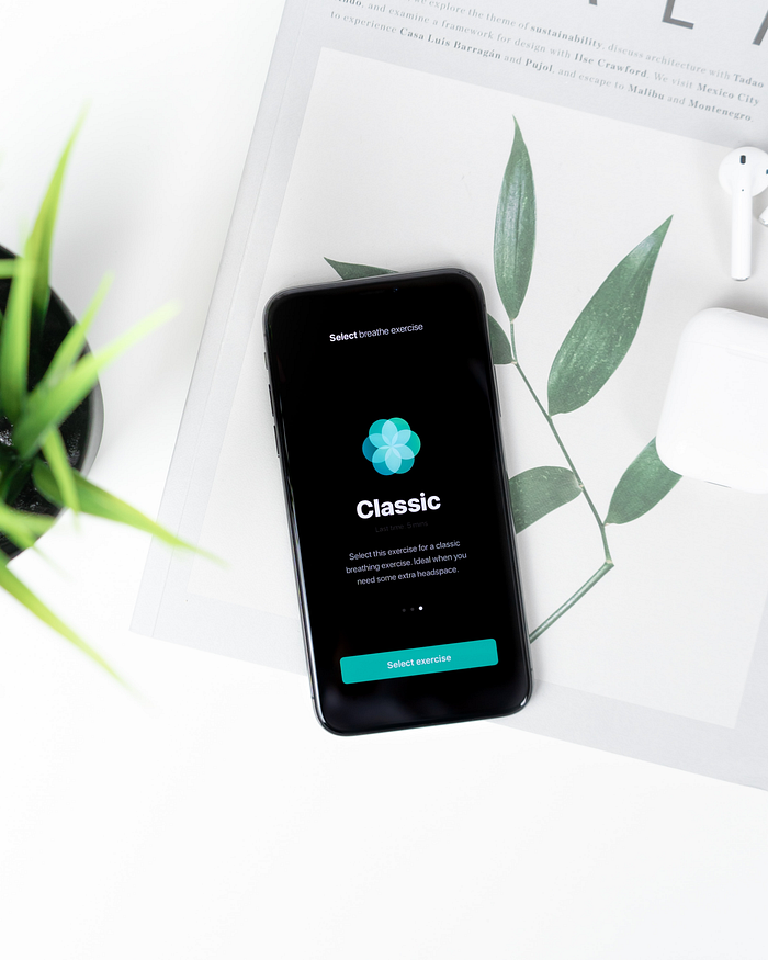
If your website’s buttons are not labeled and look generic, people will not know what the buttons do. This will confuse and give users a bad experience with your product. It would help if you stopped this from happening, and you can do this by using button labels.
The labels that you use need to describe what the buttons will do when the user clicks on them. You need to explain the actions clearly. When you start doing this, your users will enjoy their experiences with your products more than they used to.
If an UX button is intended to delete something from the website, it should be labeled with the word delete. The typography used should be legible for all users. If it’s challenging to read, you must change that now. If the button requires a confirmation, you must also clarify those options. If the confirmation has two buttons, one which lets the user delete and another that cancels the action, you need to make this simple to understand through button labeling primary action. Don’t just label one button OK and another cancel, as this can need to be clarified for specific users.
Consider Button Sizes
You need to think about the size of the buttons and what that will communicate to the website users. Bigger buttons will seem more important to users, and they will be more likely to click on them. Make sure to prioritize the button sizes on your website or mobile apps.
If a button is essential and you want people to click on it, then make it evident that you want people to click on it. Make it bigger and ensure the color on that button attracts the user’s attention. The color should contrast the background color to make it easier to see.
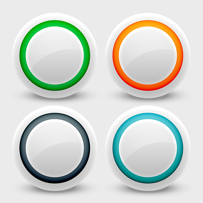
Button Locations Matter
You need to place buttons where users will expect to find them. This is important as not doing this can make users feel frustrated and leave your website and application. You should follow the traditional button design practices that other designers are using. Make sure users can learn something new about using your website. This is a great way to cause those users to stop using your product.
You should test your button placements with your target users before you launch your website or application. If you have already found it, you need to try it quickly to make the right changes before the user experience is negatively affected.
Give Feedback When Users Interact With Buttons
You need to provide visual or audio feedback when someone clicks a button. This is something that users expect, and by doing this, your website or application can feel more responsive. This will lead to a bad user experience and cause users to not return to your website or application.
If there is no visual or audio feedback, the user might think the action wasn’t received and do it again. You lead them to click the button until something continuously happens on the screen.
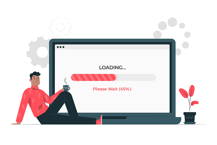
You can show the progress being made when a user interacts with something. You can show a progress bar that will communicate to the user that they need to wait until the website is finished with what it is doing. There are different ways you can provide feedback. Make sure the input you provide makes sense for your brand and the brand personality you want to communicate to people.
Limit The Number Of Buttons
Only have a few buttons. You should follow this simple rule when designing a website or application. Only show users buttons to interact with to get what they want. Everything else can be removed.
Traditional Button Designs
The buttons you add to your website or application need to look familiar. If you don’t need new button designs, use the designs that users are familiar with. You can look at other websites and applications to find the designs you can use.
Mobile-Friendly Buttons
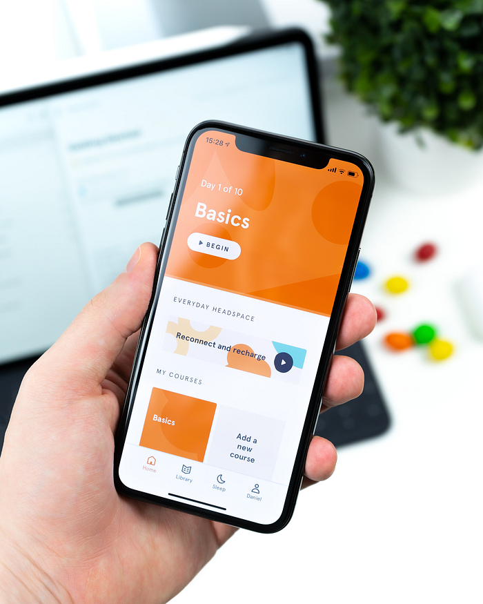
Many people use websites by accessing them on their mobile devices. This means that your buttons must be easily pressed when users use touchscreen inputs. It would help if you made the buttons more prominent. When doing this, you will need to consider the size of the website’s screens. Doing all this can be difficult; people hire website companies or web design firms to help them do this without making any beginner mistakes.
Thanks for reading!
Follow me for getting regular stories on Web Design, Branding, and Logo design.

