5 Web Design Rules You Should Try to Break
A list of web design rules to break
Web design rules are created to help designers build websites that look attractive. These rules make it easier for designers to create beautiful websites, but they can restrict web designs and cause websites to look the same.
These rules can become outdated, and following them can detriment web designers. We want to tell you about design rules that you should try to break to create great web designs, help your website look unique, and grab people’s attention.

Don’t Use White Space Excessively
White space is the area between visual elements in a web page that is not being used. This unused space helps to keep web designs from becoming cluttered. White space doesn’t need to be white; it can be any color, and it is used by designers to group elements together and separate elements to keep their designs coherent and easy to understand.
A web design rule advises you not to use white space excessively. But this is not a rule you must follow for your website design to be great. White space should be used when appropriate, meaning that different websites will have varying degrees of white space used within their design.
If white space can be used to help you guide your customer’s attention to specific parts of your website, then you should use it. If you don’t know how to use it effectively, find web design agencies to help map out where white space should be used and how often it should be used.

It Would Help if You Did Not Use More Than A Few Fonts
This rule helps make sure that you don’t overdo it with fonts. Using too many fonts can cause your web design to look messy and unstructured. You want to avoid this unless that is the design you want to present to website visitors.
It would help if you thought about branding when choosing your fonts; the fonts you use in your web design should match your brand and be consistent with all your other branding elements. If you don’t know how to do this, find a web design company to help you decide what fonts you should use.
If you want to use lots of fonts, you must ensure they don’t distract web visitors from the website’s content. The content should focus, and the fonts you choose should highlight the critical content. There should be a purpose for each of the fonts that you use.

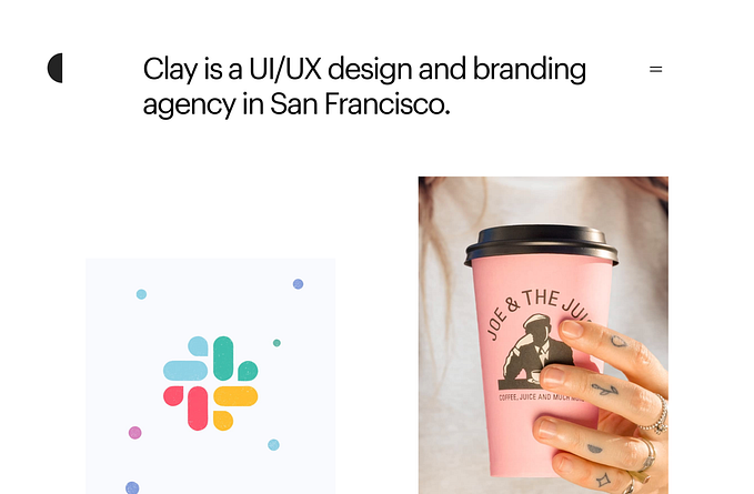
Avoid Bold Background Colors on Web Pages
If bold colors need to be used to reflect your brand’s personality, you should use bold colors in your background. Web designers are now more aggressive with color choices than the lighter palettes they used.
The colors you use can create a good or bad first impression, so choose the right colors and think about color psychology when deciding on the right color palette. If you don’t know much about color psychology, you should find design studios for you. It is advised that you have a small color palette, no more than several colors, but this is a guideline, so if it’s appropriate, you can use more.
The colors you use need to have a purpose; think about why you use the colors you have chosen. You shouldn’t just use colors because they look great; while this is important, color psychology needs to be considered.
Consistency is essential, and you must ensure that the color palette you are using is consistently used across all of your branding elements.

Creating Symmetrical Designs
Your website’s design doesn’t need to be symmetrical; an asymmetrical design can look great and make your website look attractive. You should not limit your website’s design by thinking it needs to be symmetrical; this is a trap web designer can fall into, creating a limitation for themselves that doesn’t need to be there.
Asymmetrical designs can look exciting and encourage people to stay on the website and look through everything the website offers. When creating web designs, you need to create the right balance between the elements being used, the white space, and the content. This is important, and it can ruin the website’s design if it isn’t done well.
When creating the design for your website, think about how people will see it. Does the design guide a website visitor through the website and lead them to the critical content? If it doesn’t, you need to think about how to design your website.

Use The Grid System
If you are a designer, you will have already come across the grid system. While the grid system gives you a guideline that you can follow to start creating your designs, it isn’t a method that you need to use when designing. If you have an idea for a website’s design, and the grid system isn’t a part of that design, don’t use it.
Not all designers like to use the grid system, and this lets them come up with creative designs that are unique and unforgettable. If you don’t know what your website’s design should look like and what method you should use, find a website company to help you decide what to do.
Conclusion
Design rules need to be followed when designing a website, and others that do not. You can break these design rules to create a unique and unforgettable website. Experiment with different variations and find the right web design for you.
Thanks for reading!
Follow me for getting regular stories on Web Design, Branding, and Logo design.